Recovery Centre
Recovery Centre, Tedworth House, Wiltshire
Turning a former stately home like Tedworth House into a Personal Recovery Centre for wounded soldiers is a very untypical project for the office to be involved with and it came by a rather obscure route. Francis’s best friend from school, now Major Mark Goodwin-Hudson was an officer serving at Tidworth Barracks. His officer’s mess was Tedworth House which was going to be mothballed as part of government cuts to the defence budget. This depressed Mark as he had a great interest in classical architecture from his time at Stowe and later his degree in Art History at the University of East Anglia. He hated to see this wonderful building not being used. At the same time Bryn and Emma Parry, the founders of Help for Heroes, who lived locally were having the same thoughts and dreamed of turning it into a recovery centre for wounded soldiers. Mark and the Parrys worked together to allow Help for Heroes to take over the house. When it came to choosing an architect, they felt it was important to choose an architect who was sympathetic to the classicism of the original building. It was then that Mark contacted Francis and the office was pleased to work for such a worthy cause.
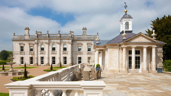
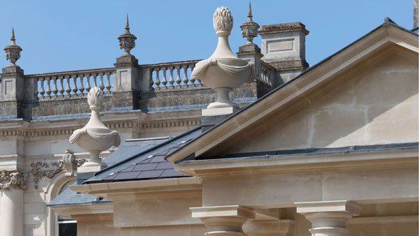
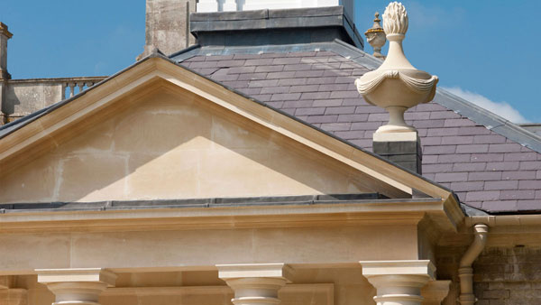
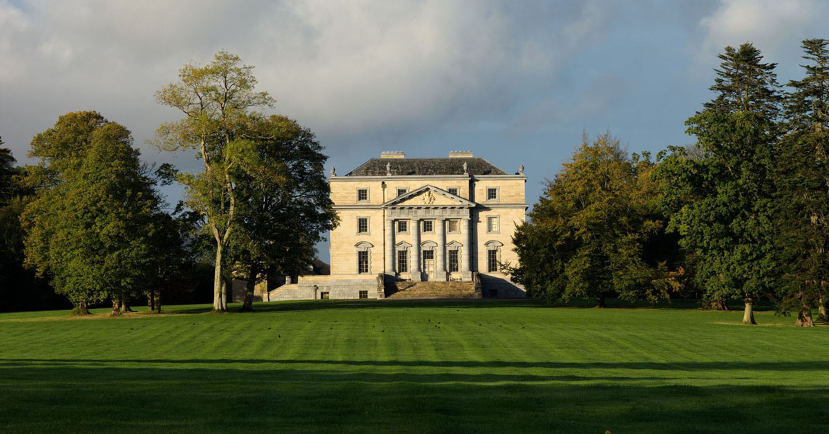
Tedworth House was originally built in c.1829-32 to a restrained Greek Revival design, apparently by the owner, Thomas Assheton Smith, but extremely close to Spetchley Park, Worcestershire, of 1811 by John Tasker. It was remodelled in 1878-80 for Sir John Kelk, a building contractor, by John Johnson who faced the original building with Portland stone façades in a Roman Baroque manner like that of Thomas Archer’s Heythrop House, Oxfordshire, of 1707-10.
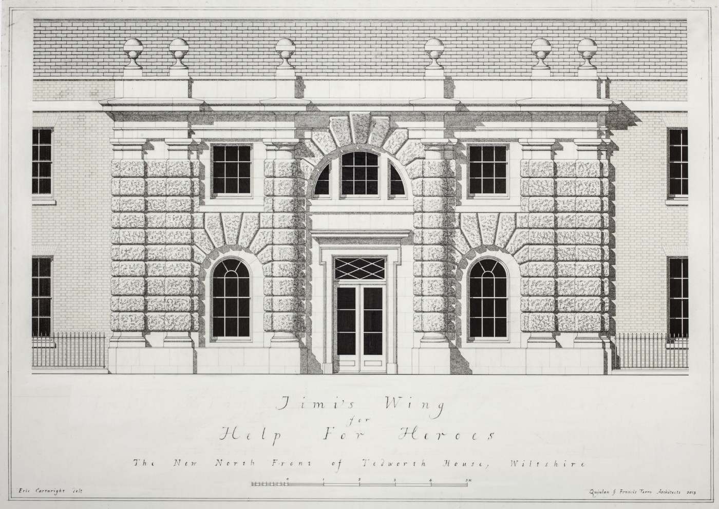
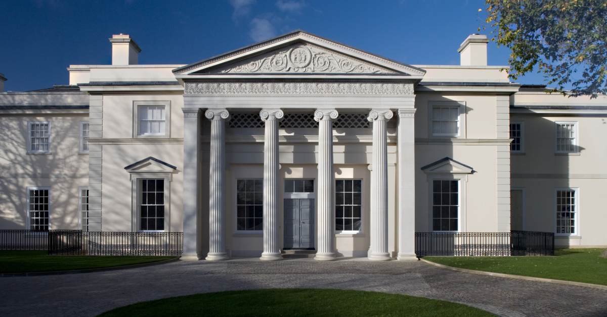
The extensive contribution of Quinlan and Francis Terry to this project include the restoration and extension of Tedworth House to which they have added a new building, known as Jimi’s Wing, to the north of the existing house where it forms the new north entrance. The centre of the principal north façade of Jimi’s Wing is inspired by the powerful entrance front of the Villa Giulia, Rome, of 1550-55, by Vignola, robust master of the orders. The choice of this precedent came from Francis who felt that the conventional office proposal for a pedimented, four-columned portico as at the Royal Hospital, Chelsea, would not hold together such a long low elevation or relate to the nineteenth century classical language of Tedworth House.
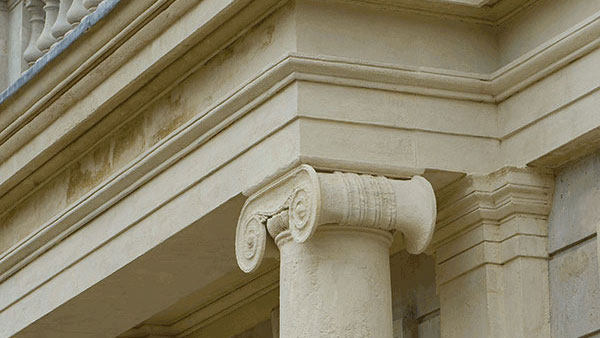
Vignola had provided the three central bays of its seven-bay long façade at the Villa Giulia with an entrance archway which has vigorous voussoirs and is flanked by massive Doric columns with heavily banded rustication. On each side is a narrow bay flanked by Doric pilasters with banded rustication and containing a round-headed niche, also with voussoirs. This composition forms the ground floor of Vignola’s two-storeyed façade so that the columns and pilasters are one-storeyed, but Quinlan and Francis Terry have inventively turned these into a giant Tuscan order rising through two storeys so that the great central arch is now lifted to the upper floor where it surrounds a Diocletian window. They have also widened the bays on either side of Vignola’s central archway to allow for generous rounded-headed windows set in reveals, to take the place of the small blank niches. As a result of this extension, the pilasters at each end are now doubled.
One reason for this enlargement of Vignola’s composition is that the building at Tedworth is four bays longer than the Villa Giulia. The imposing centrepiece at Tedworth, built in a combination of Whitbed and Roachbed Portland stone, is flanked by two-storeyed four-bay wings of yellow brick, lit by sash windows and terminating in powerful stone quoins. The building contains bedrooms for fifty wounded soldiers with additional accommodation in the basement. It is a tribute to the endless vitality of the classical language as well as to the imagination of Quinlan and Francis Terry that a building which began as a pleasure villa in Rome for a Renaissance pope should provide inspiration nearly six hundred years later for a hospital for wounded soldiers. As T.S. Eliot said in ‘Little Gidding’, ‘the end of all our exploring will be to arrive where we started and know the place for the first time.’
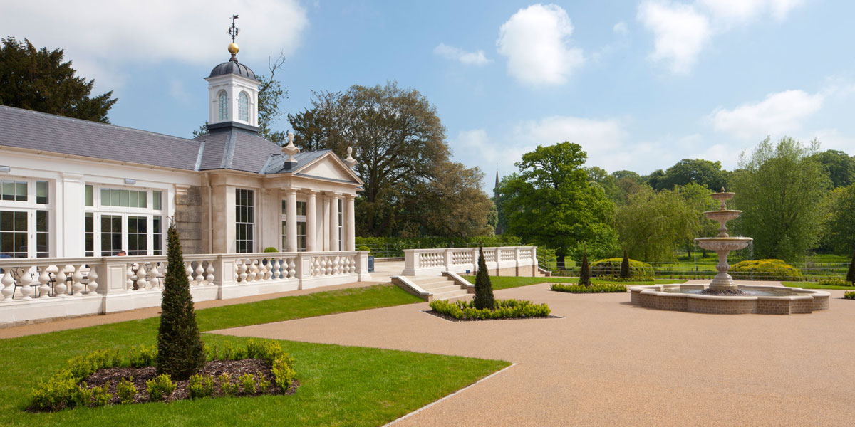
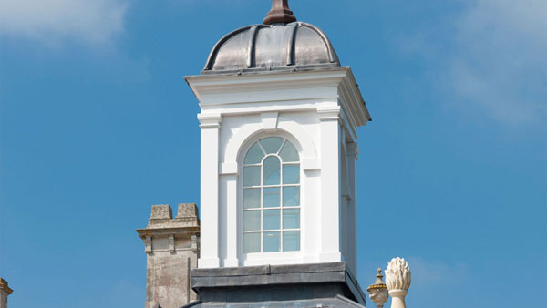
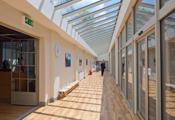
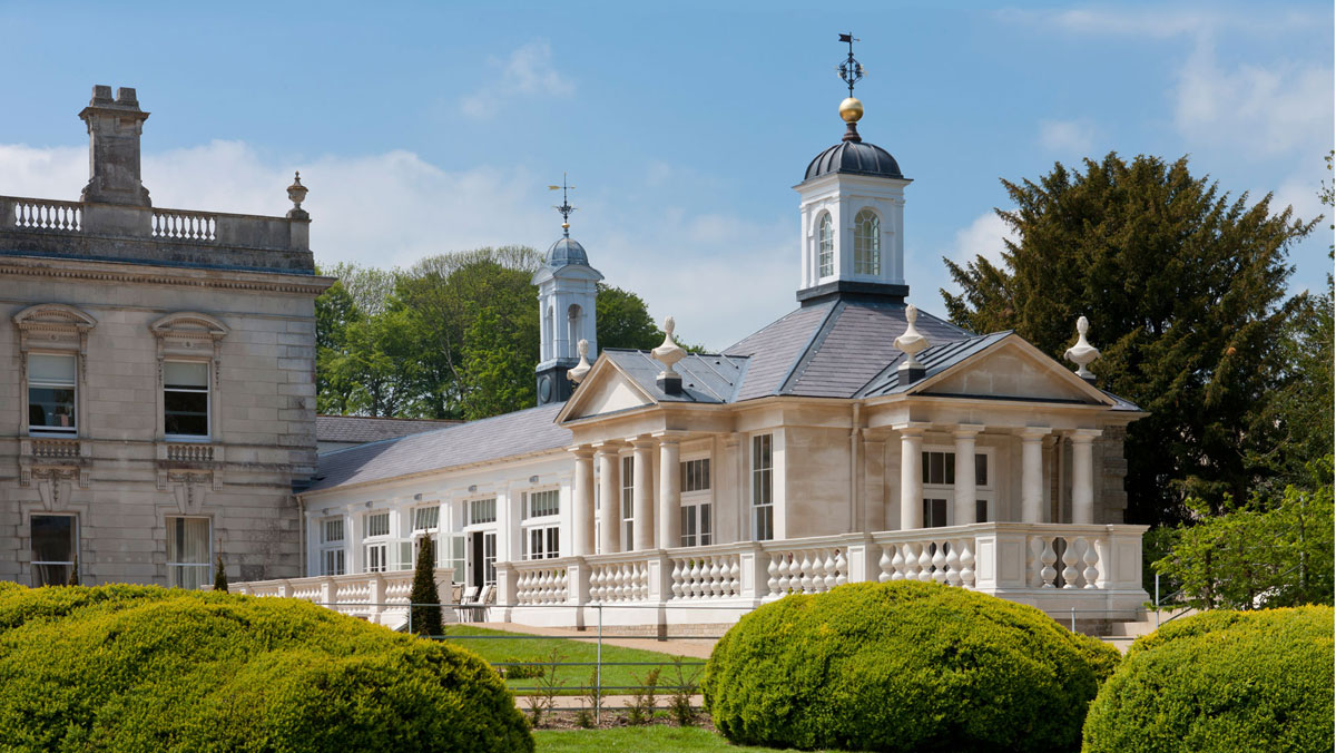
A further major addition by the Terrys is the long range which runs east from the north front of the old house and overlooks the east lawn. Containing a conservatory and coffee shop with a fully glazed south front divided by Doric pilasters, this draws some hints from the Palm House on the south front of the old house. It terminates in a pavilion which has a Doric pedimented portico on its south and east fronts and is crowned by a cupola and weather-vane. This building forms a new social centre for the occupants and has steps leading down from its south portico to the large east garden, laid out by the Terrys with a central fountain and twelve yew obelisks.
They have also added four sets of ornamental gateways of which the most important is in axis with the existing south front of Tedworth House at the end of the drive. In carefully crafted ironwork of high quality, this is a tripartite composition with ornamental overthrows crowning each part, that in the centre incorporating the legend H 4 H, that is Help for Heroes, 2012. In the context of the pedimented façade of Tedworth House, which can be seen through it, the gateway is appropriately inspired by eighteenth century gates to Gray’s Inn Gardens, London, sketched and measured by Quinlan Terry in 1980.
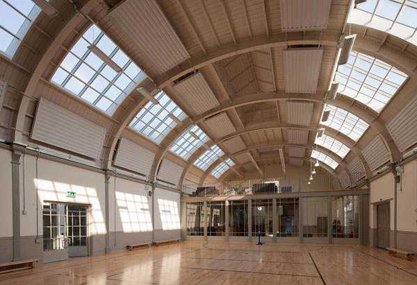
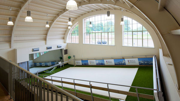
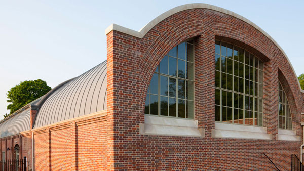
A further commission at Tedworth was to convert a disused Edwardian indoor skating rink into a state of the art fitness centre with cardio-vascular exercise machines, a movable ski slope and small swimming pool. With its elliptical zinc roof and windowless, brick walls, this building was industrial in character but in order to accommodate the required facilities, it needed to be massively extended. Since this could have led to the addition looking too big for the original building, Francis came up with a design which involved extending it the same style and allowing the natural fall of the land to make the majority of the building underground.
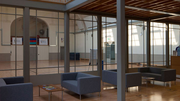
Since the original building lacked windows, a giant Diocletian window was added, though with glazing bars of metal rather than timber to reflect the industrial style. Francis also felt that for the interior, full bodied classicism would not work with the modern machinery and equipment needed, so he paired everything down to the minimum: steel columns are exposed, oak timber left untreated, and the whole inside painted in shades of grey and white. The final appearance is similar to the interiors of Shaker buildings. It is very untypical of the office to work in this style and reminds Francis of the type of work he did at University where the nineteenth century industrial vocabulary was the only common ground between him and his tutors.
Another unusual aspect of this building is the time it took to build, which must be the quickest in the history of the practice. Francis did his original sketch in July 2011 and the building was opened in October 2012. Bearing in mind that most buildings by the practice take a minimum of three years, it is an extraordinary achievement. This is a testament to Vinci, the contractor, and most particularly to the foreman, John Thomas, who had a very dynamic and collaborative attitude throughout the project. Also, the local planning authority was extremely helpful on this significant listed building which could have taken an age in wading through all the red tape. This positive attitude from all sides was to a great extent fuelled by everyone’s desire to help an extremely worthy charity achieve its ends.
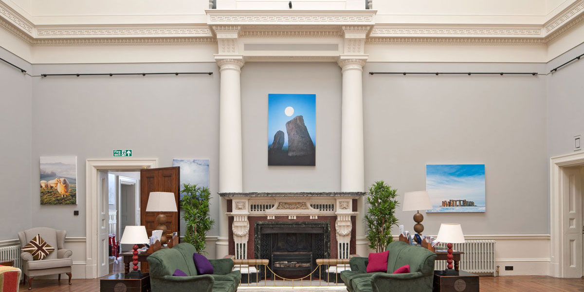
There has been criticism in the media that some of the money given by supporters of Help for Heroes has been spent on the grandeur of the architecture rather than on the facilities needed by wounded soldiers. These critics even implied that the marble statues of the Three Graces in the central hall are a waste of charitable donations. Like all such ill-informed criticism, it is not based on fact, for the Three Graces were left by the previous occupants. The imposing wrought iron gates were paid for by Vinci, the main contractor, as a donation. Quinlan and Francis Terry made a substantial donation to cover the additional cost of Jimi's wing, and the quantity surveyors, BWA, and the structural engineers, the Morton Partnership, all made donations to Help for Heroes in recognition of the work they have undertaken and because they all felt that wounded soldiers should be honoured, not only by having all the best technical facilities, but also that they should be accommodated in beautiful and imposing buildings that honour them for the sacrifices they have made for their country.
Taken from The Practice Of Classical Architecture by Professor David Watkin, Published by Rizolli, 2015
