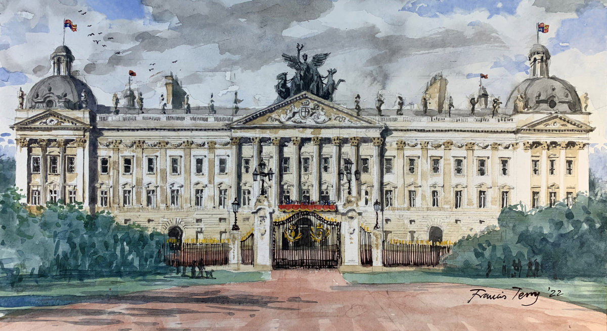
Buckingham Palace Redesigned
In celebration of the Queen’s Platinum Jubilee, Country Life ran a lighthearted competition to improve the front elevation of Buckingham Palace. Most architects hate this façade as it is seen to represent everything that is wrong with classical architecture. Imperious, pompous and grandiose are some of the adjectives used to describe this building.
I am unusual within my profession because I actually really like it and so I do not feel it needs changing. But if I could make alterations and in the festive spirit of the challenge, this is what I would do.
- It has a dull silhouette which needs enlivening with domes and sculpture.
- The central portico would benefit from being widened, a four columned portico on such a wide elevation seems like a wasted opportunity.
- The small windows at capital level, I would replace with stone swags.
- The courtyard could do with a few trees framing the entrance.
Apart from these small tweaks, the rest should stay as it is.


