What Informs Architectural Taste?
Taste is a curious thing and I have often wondered how it works. Things considered tasteful can stop being tasteful, seemingly for no apparent reason, but there must be more to it than that. For example, the taste for sweet things in preindustrial England would be heightened by the lack of readily available sugar and sweeter fruit from hotter countries – our native apples are rather sour. Therefore, the sweetness would be associated with wealth and luxury which is almost the opposite now. This can be most clearly seen in the attitude to pineapples, which has changed radically over time.
The first pineapple to reach Europe came on a ship sailed by Columbus, returning from his second voyage from the new world in 1496. Although he bought many of these exotic fruits back with him, all but one rotted – which he gave to the King of Spain. Peter Martyr, a tutor to the Spanish princes, recorded the first tasting: –
“The most invincible King Ferdinand relates that he has eaten another fruit brought from those countries. It is like a pine-nut in form and colour, covered with scales, and firmer than a melon. Its flavour excels all other fruits.”
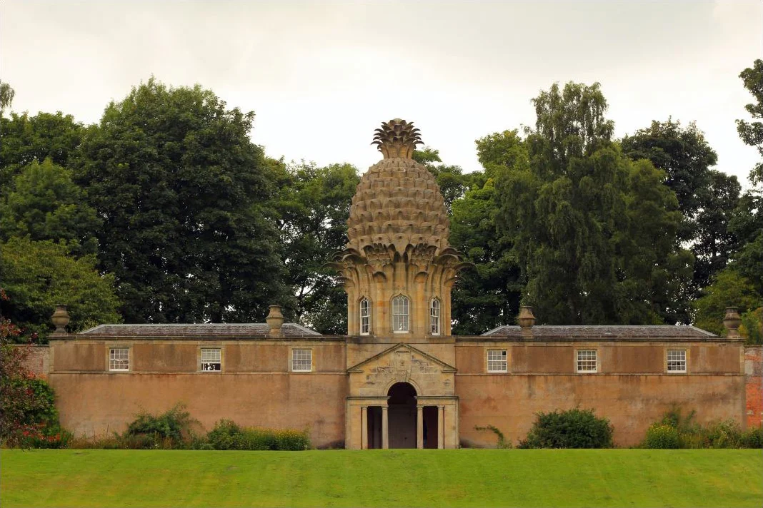
From that moment the pineapple became a fruit of legend, highly prized and beyond the reach of everyone but royalty. The cult of pineapples grew, and it became a familiar motif of baroque and Neo-Classical architecture to represent wealth and good taste. It was generally used, at a small scale, for decoration, but it was also used to generate the design for a whole building known as the Dunmore Pineapple in Scotland.
Over time, resourceful botanists worked out that pineapples could be grown in England using heated greenhouses and attentive gardeners. The price tag for these fruits was the modern equivalent of £8,000 each and so they were rarely eaten, they were instead used as ornaments for banquets and rented out by the night.
So, how did the fruit of kings become one of the least sophisticated canned goods on our supermarket shelves? With industrialisation, the sourcing of pineapples from distant shores and putting them in cans makes them cheap. We like things most which we can’t have, and once something becomes cheap it loses its allure, and the chattering classes move on to something else.
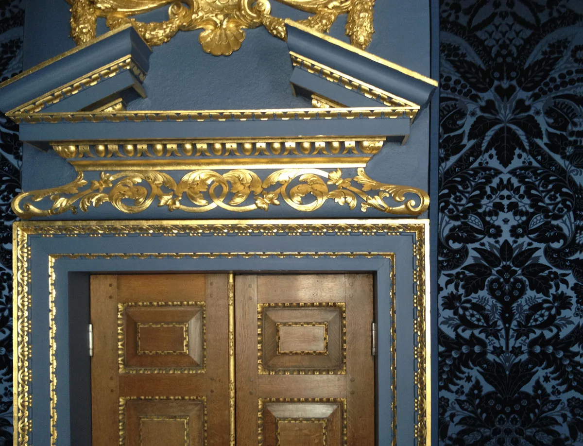
The same has happened to colour, the painted interiors of Chiswick house were the height of good taste in the 18th century. But now if you were to paint an interior in this way it would be perceived as gaudy. Preindustrial bright colours were hard to produce, blue was made from ground Lapis Lazuli from Afghanistan and purple was the colour of emperors because it demanded vast quantities of a gland from a specific sea snail to produce even a small amount. Now any colour is as easy as each other to produce and so good taste has become the absence of colour.
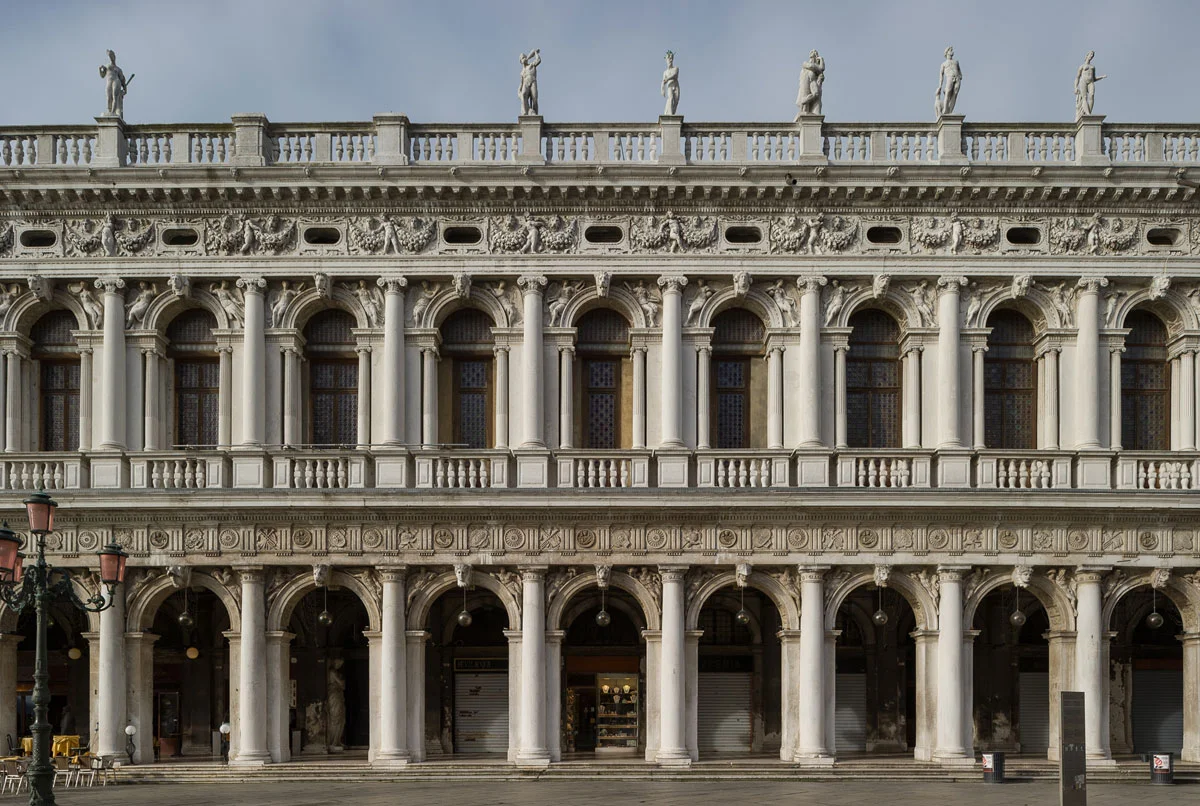
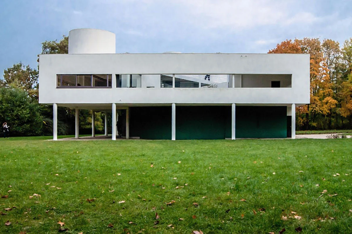
This phenomenon is also true of ornament. Traditionally architects would make their building as ornamental as the purse would allow. Palladio (wrongly perceived as a minimalist) praises Sansovino’s Biblioteca Marciana in Venice as “…the richest and most adorned edifice, that perhaps has been made since the ancients…”, implying that ornament equates to beauty. But since industrialisation when ornament could endlessly and easily be squeezed out of a mould, the value of ornament – which would have been hand carved – loses its value. This has led to a belief, first voiced by Adolf Loos in his essay ‘Ornament is Crime’ of 1908, which suggests (with various rather questionable and often slightly racist examples) that ornament is inversely correlated to cultural sophistication. In other words, the more civilised you are the less you need ornament and he sites examples of so-called ‘primitive’ societies who ornament everything, including themselves. He concludes that, ‘Lack of ornament is a sign of spiritual strength’. Le Corbusier’s Villa Savoye perfectly illustrates this trend in built form; an architecture style free from colour, ornament and any historical references.
White and minimalism became tasteful and the style of choice for the rich and glamorous while normal people preferred something a little sweeter and prettier using ornament, colour and an abundance of historical references. The tastemakers would perceive this as provincial and unsophisticated. Modernism was expensive because it was not hugely popular and could not be mass-produced in the same way as less sophisticated architecture. This has been the basic default setting from the 1930s to almost present day. I say almost because now the roles have flipped thanks to the grassroots success of modernism. Helvetia has become the most used font, everyone knows the funny names that Farrow and Ball give to different, yet almost indistinguishable shades of white, and Ikea have metaphorically put the once unattainable pineapple in cans on our supermarket shelves.
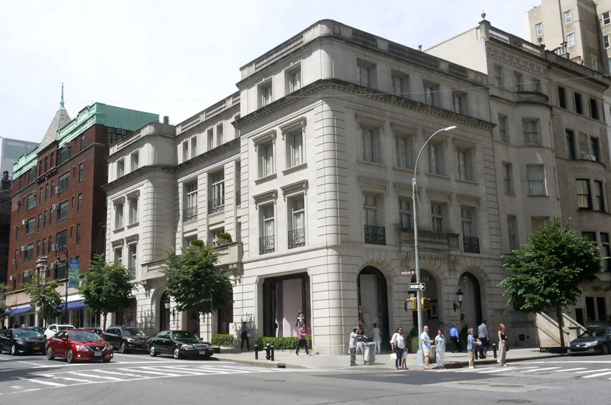
Now that the modernist aesthetic is available to everyone at a very low price, the chattering classes and tastemakers are hunting around for something else. A recent example of this trend is Ralph Lauren’s new flagship store in New York, which is not the usual glass modernist stump one would expect but a beautifully designed classical building in stone. Likewise, the more forward-looking journalists and students in architectural schools are getting excited about colour, ornament and historical styles… it is an exciting time to be a classical architect!

