Northampton: Narrow Fronts, Many Doors
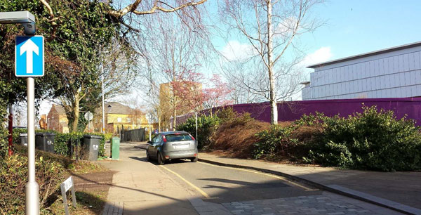
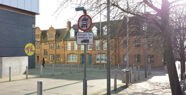
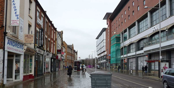
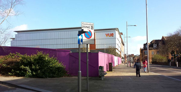
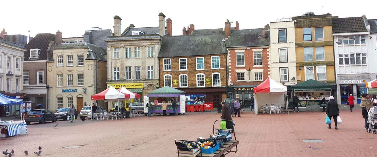
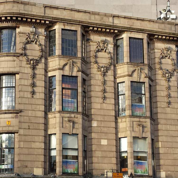
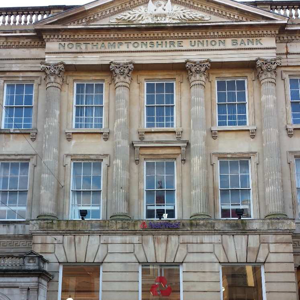
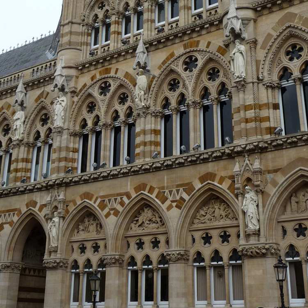
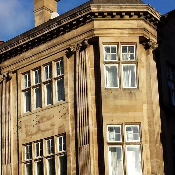
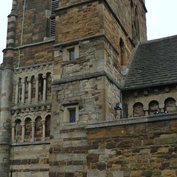
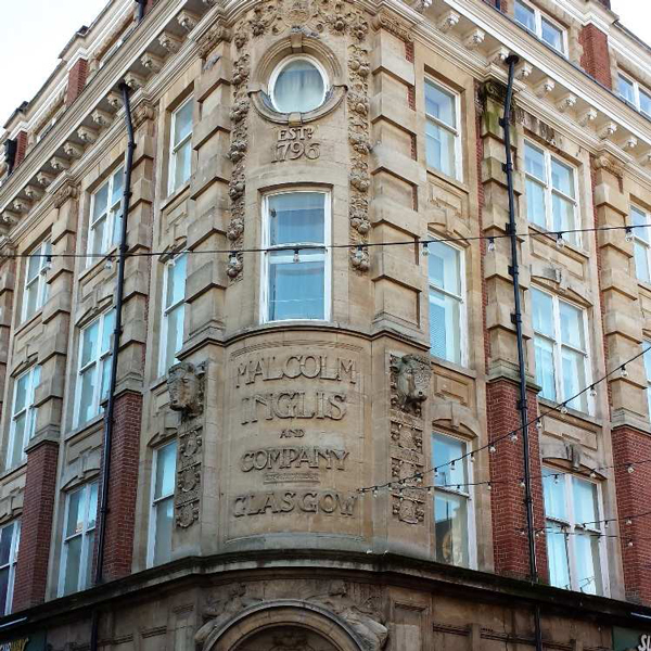
One of the dominant features of many historic towns is that traditional town buildings are narrow ranging from two to five windows wide. Flowing from our work together in London, we were asked to work up a design for an empty and disused former office site (Marefair) near Northampton town centre. Although the town’s centre preserves much of its historic qualities, the area between the town centre and the train station has been rather distended by faster roads and several misjudged large and featureless blocks that seem designed to be driven past not walked past. They break the rhythm of the street and do not encourage people to spend time in their presence.
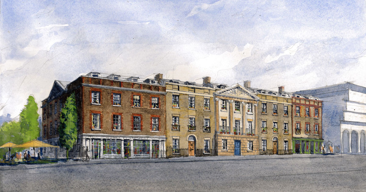
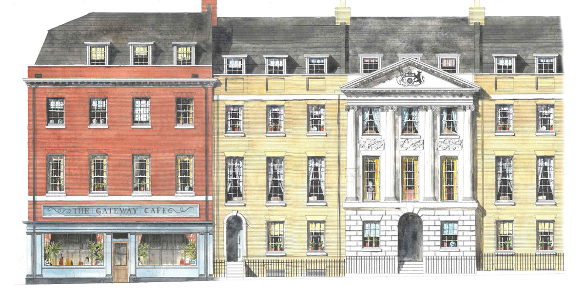
Our approach to the Marefair site was therefore not to replace one large building with another large building but instead to create street fronts and rediscover and assert their rhythm with narrow plots and many doors.
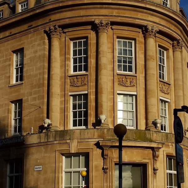
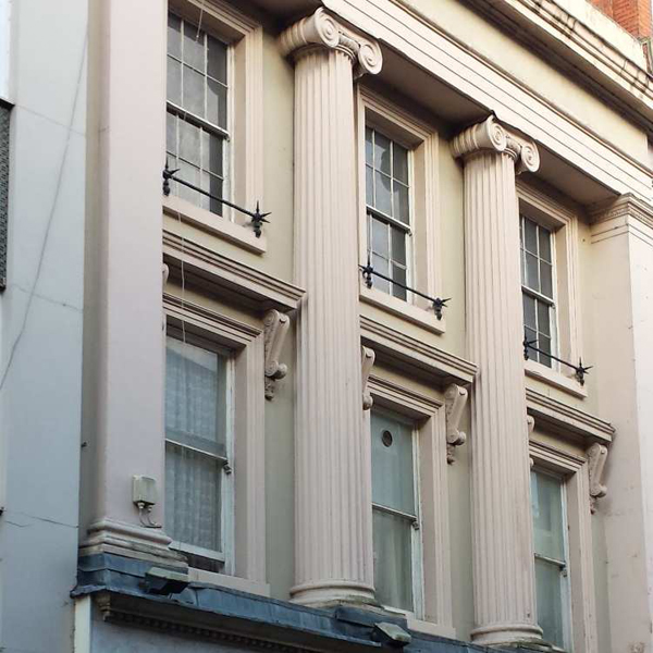
The façade facing onto Marefair itself was the grandest, with the central bay replicating the use of ionic porticos elsewhere on the street, one in a baroque style and the other in a Greek revival style. We decided that a Scamozzi ionic would be the most suitable as it is the capital used for the baroque portico on Marefair and also at All Saint’s church further down the road. The two terraced buildings next to the central portico could either be read as part of the porticoed structure or they could be seen as three separate entities. This type of dual reading was common in the Georgian and Victorian periods to give the individual terraced house an identity as well as giving the group of houses a grandeur worthy of a town centre. This can be seen at Bedford Square, London, for example. We did not want the palace façade to dominate the street and so we changed the styling of the terraces at either end. Along Marefair, ground floor windows were the largest, reflecting both the internal design and the piano nobile of Georgian tradition. Two outer buildings were to have shopfronts.
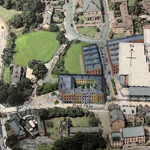 Due to the slope on the site and the requirement to provide a level approach to the rear of all the properties from the car park, the ground floor was raised for the terraced houses on Marefair. This required steps up to the front of the door (with level access from the back to meet regulations). This is a feature of many traditional terraces and we were keen to emulate this. It also has the advantage that the residential accommodation on ground floor is raised from the street and so gives a certain amount of privacy to the occupier.
The Chalk Lane elevation was also significant. It consisted of two buildings. The one next to Marefair is symmetrical and pedimented with a curved Doric porch. This elevation is very important as it is the first part of traditional urbanism one sees on a walk from the station to Northampton’s centre. For this reason, we decided that the corner building should be a significant architectural statement to ‘announce’ the town. We therefore included the Northampton coat of arms within the tympanum.
The north elevation we treated as three different buildings, but left the architecture very simple which we felt was appropriate for the back of the building. The two buildings at either end are detailed with conventional Georgian style sash windows of three over four panes. For the central part of the block we looked at local Victorian examples where two over two is used. Also, in the spirit of the Victorian style, we designed small brackets holding up the window sills.
The east elevation consisted of three different styles of building. The Marefair building was designed in an early Georgian style, the middle building was designed as a warehouse and the north building in a simple Georgian style consistent with the back elevation. Northampton has many warehouses dotted throughout the town. We felt it was a good idea to pick up on this tradition although we did not want the warehouse aesthetic to dominate.
Throughout, external façades were proposed to be a mixture of red brick and buff coloured brick to create contrast For the interior of the block the materials were designed to be as light and reflective as possible (as inside traditional urban blocks) to maximise light. This would require as light a brick as possible which could also harmonise with the exterior.
Unfortunately, as with many projects, due to factors outside the design team’s control, the scheme has been put on hold. However, it may possibly be revived in the future.
Team: Francis Terry and Associates, calfordseaden, Create Streets.
You might also like...
-
Queen Mother Square, Poundbury, Dorset
-
Mount Pleasant: Fortress or Circus?
-
West Hampstead: What is a Mansion Block?
-
Little Oval: Cricket and Gasworks
-
Wimbledon: What is It to Be Premier?
-
Euston Road: Can an Arch a Boulevard Make?
-
Empress Place: Join the Street, Don't Destroy It
-
The Sutton Estate: Anywhere or Sutton Square?
